
Hotel Booking Website
__
Designing a Seamless Hotel Booking Experience.
At the UX Design Institute, I designed a user-centric mobile app/website for hotel booking, following a comprehensive UX process. The goal was to streamline booking with a seamless and intuitive experience.
I conducted thorough research, crafted journey maps, and applied various UX techniques, resulting in a visually appealing, user-friendly platform. This project showcases my ability to apply UX principles and create compelling digital experiences.
Client
UX Design Institute
Tools
Adobe Creative
Figma
Dovetail
My role
In charge of the entire UX design process, from initial research to the creation of
high-fidelity prototypes.
Design challenge
Design and develop a simple and accessible online booking experience for a hotel's target users. Conduct research to gain insights into user preferences and pain points, and use these insights
to create a user-centric design that caters to diverse users.
Consider the overall user experience, including visual design and messaging, and ensure
a streamlined booking process with easy navigation and clear instructions.
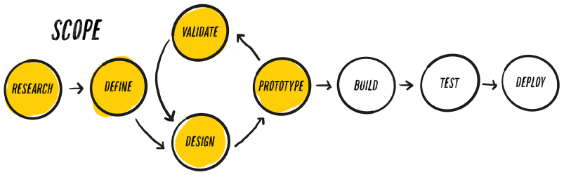
Design Process
__
The structure
The UX design process involves Research, Define, Design, Prototype, and Validate. It includes gathering user insights, defining scope, creating a user-friendly design, developing a prototype, and testing with users for success.
Research
__
Notetaking
Note-taking is essential in UX design, aiding organization, progress tracking, and informed decision-making. From four usability tests with two users, I categorized notes into four themes: behavior, positive interaction, pain points, and suggestions. I also considered timestamps, facial expressions, and context to create a user-centric design.
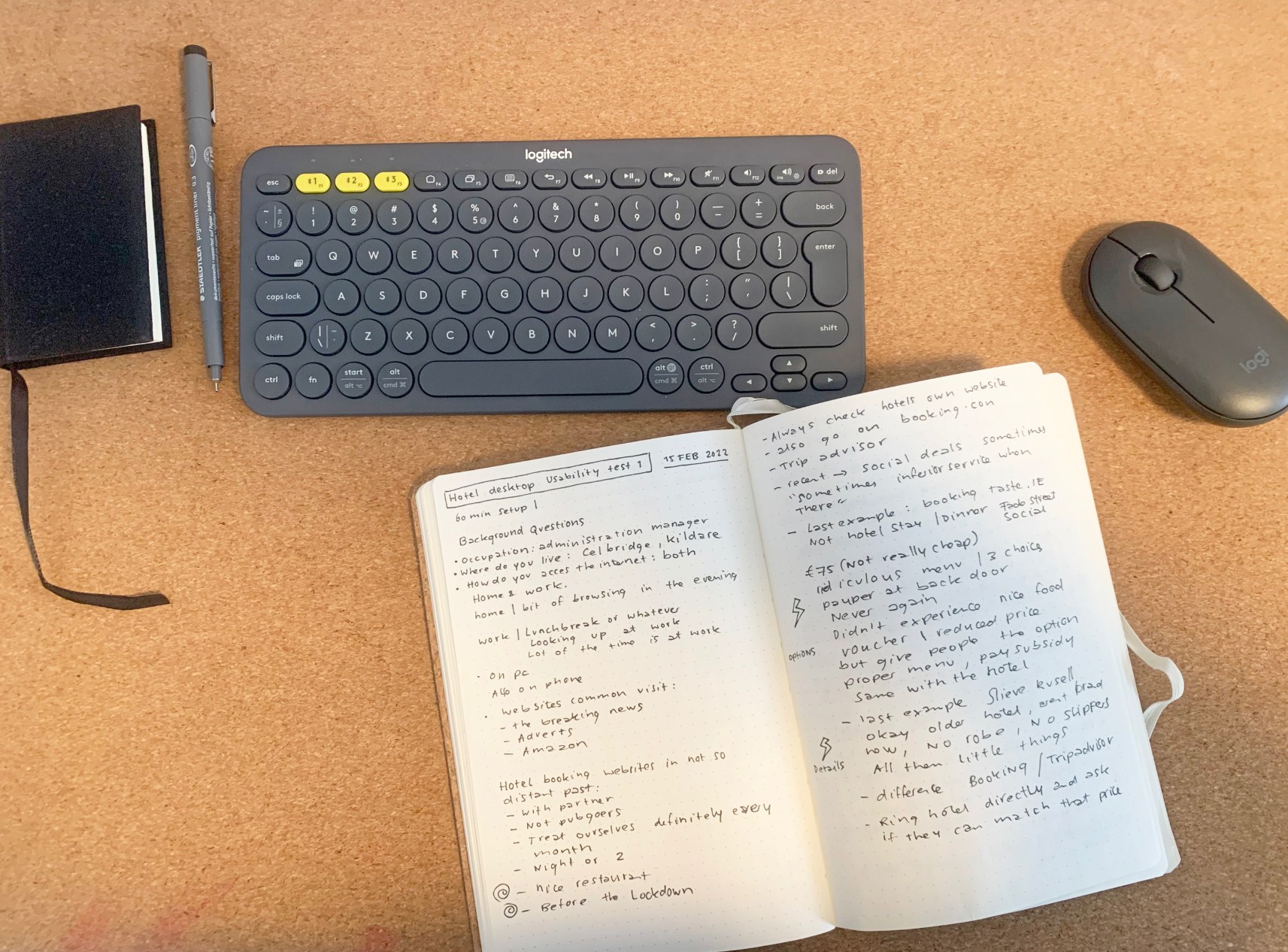
First step of note-taking is writing everything down on paper.
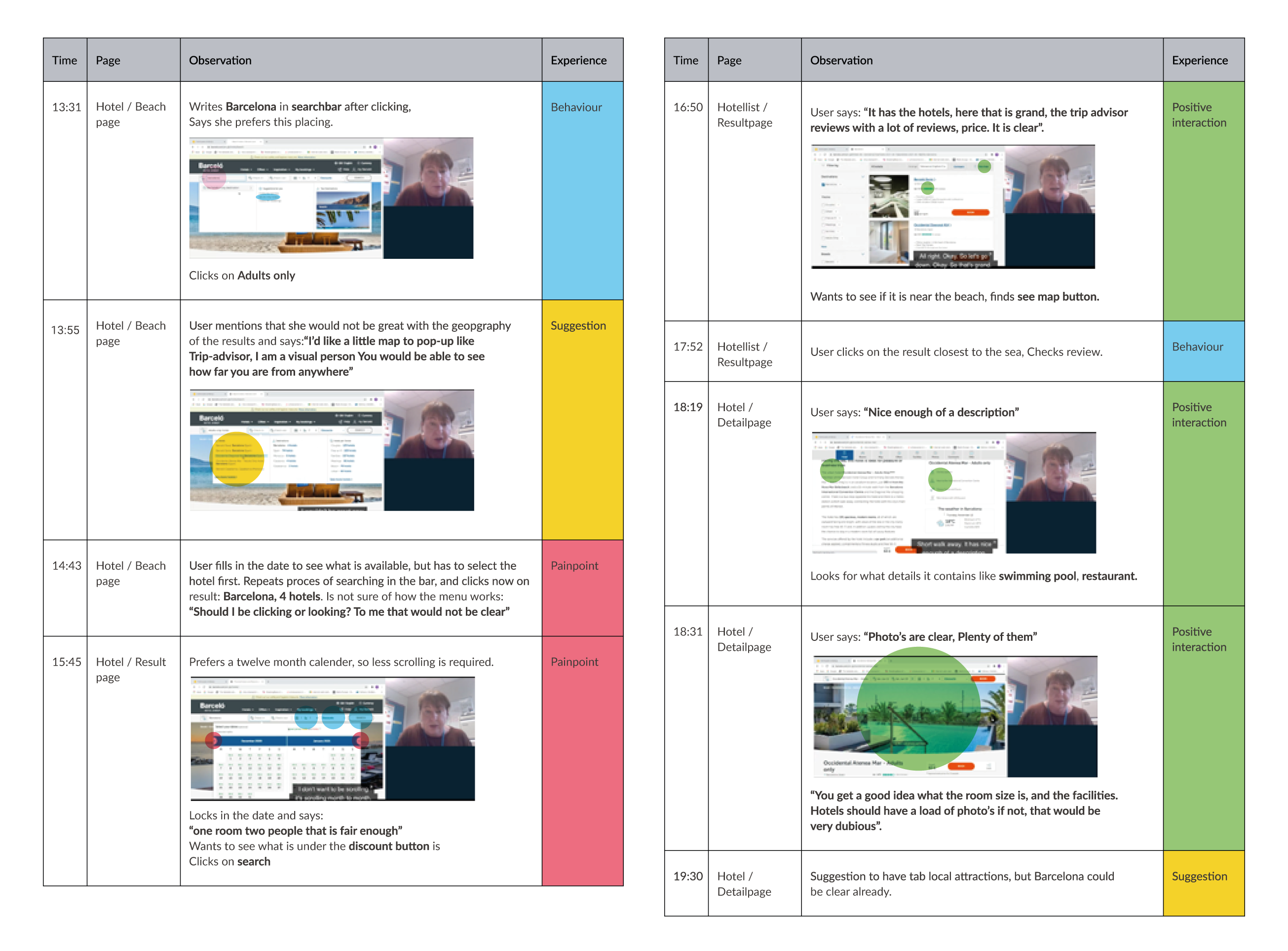
A digital note-taking PDF spread: Step two involves filling a table and categorizing into four themes, with dots serving as affordances indicating theme locations on the screen.
Key findings and insights
Affinity Diagram
My recent UX design project utilized an affinity diagram to categorize user research data, prioritize insights, and develop a user-centric design. It demonstrates my proficiency in user research and affinity diagram technique for impactful UX solutions.
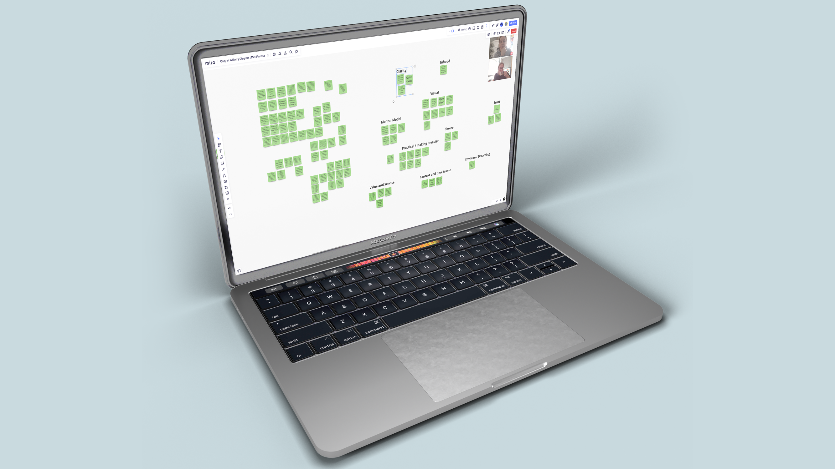
Collaborative Insights: Navigating the Affinity Diagram Process. Partnering up in an engaging workshop to structure information and map paths of understanding.
The post-collaboration Miro board captures our harmonized tapestry of insights and interconnections.
A Glimpse into One of the Miro Board Pages
Things To
Consider And
To Structure
During my journey, I discovered various insights, stumbled upon questions, and encountered diverse organizational approaches. Intriguing perspectives emerged, including the impact of COVID policies and how personality manifests during research.
Customer Journey / Empathy map
After note-taking, I created a customer journey map/empathy map to gain deeper insights into user behavior, including flow, goals, emotions, thoughts, steps, and phases.
These findings revealed user pain points and areas needing improvement for an enhanced assistance plan overview experience.
Design
__
Flow Diagram
After comprehensively understanding the customer journey through our detailed map, we created a flow diagram. It visually represents the user experience, mapping steps, interactions, and decision points in the system.
Wireframe
sketches
Wireframes are UX blueprints, mapping interactions and user flows dynamically. Yellow highlights denote interaction hotspots, bringing the user journey to life in my sketches.
Mid-Fidelity
Prototype
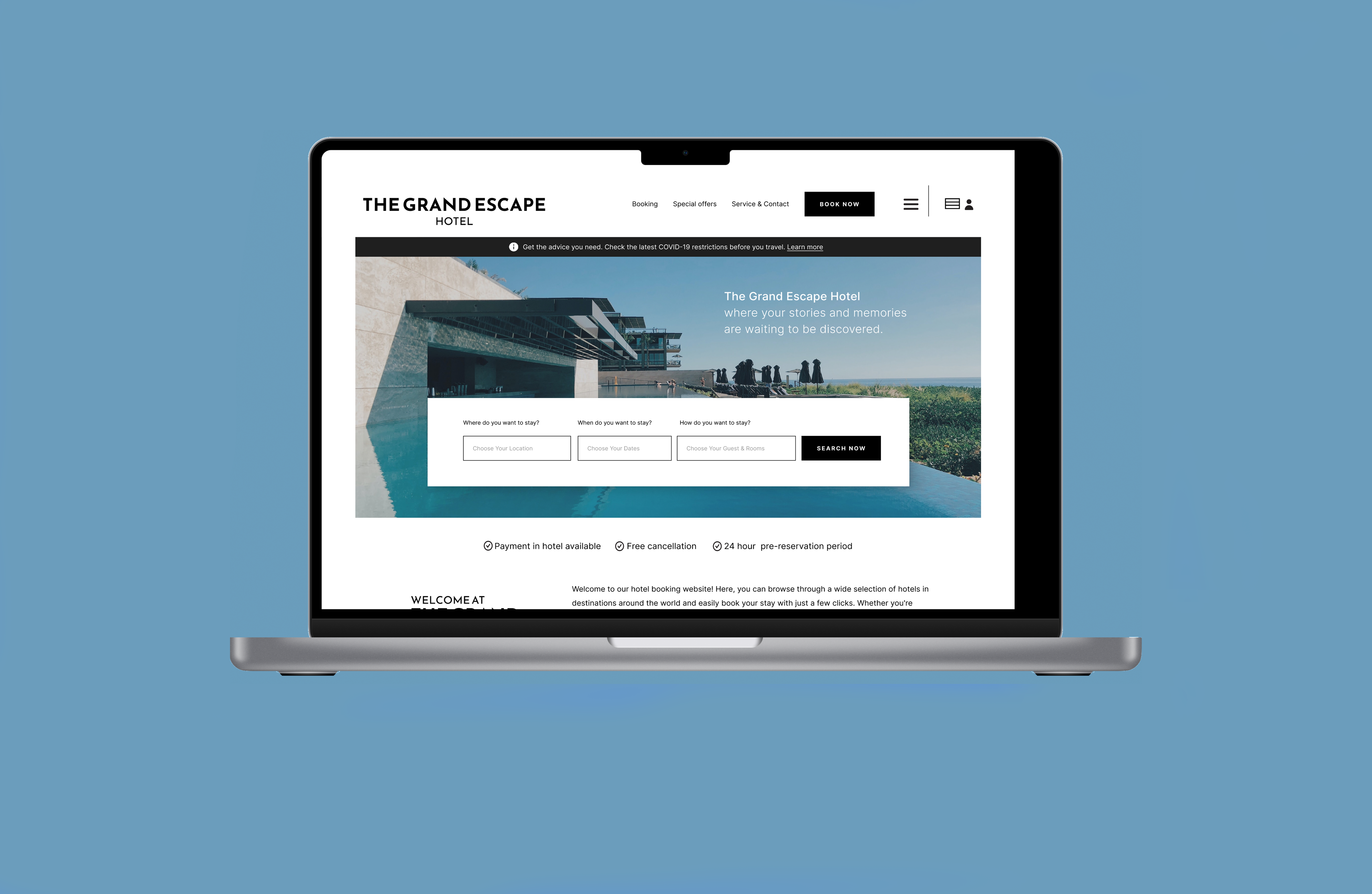
The goal was a user-centric platform simplifying hotel bookings with an intuitive, seamless experience. I used a structured approach, conducting research, creating journey maps, and applying UX techniques for a user-friendly, visually appealing solution.
Selected Works

Subject matter expert for AlphaUX Design
Transition from Lijn 1 Haaglanden to CommUpResearch, Workshops, Branding, Service Design
Hotel Booking WebsiteUX Design
Cher van Tol — UX Designer with
a multidisciplinary background
Based in The Hague
E. hello@chervantol.nl
Copyright © 2023 Cher van Tol | Portfolio. Made with Love